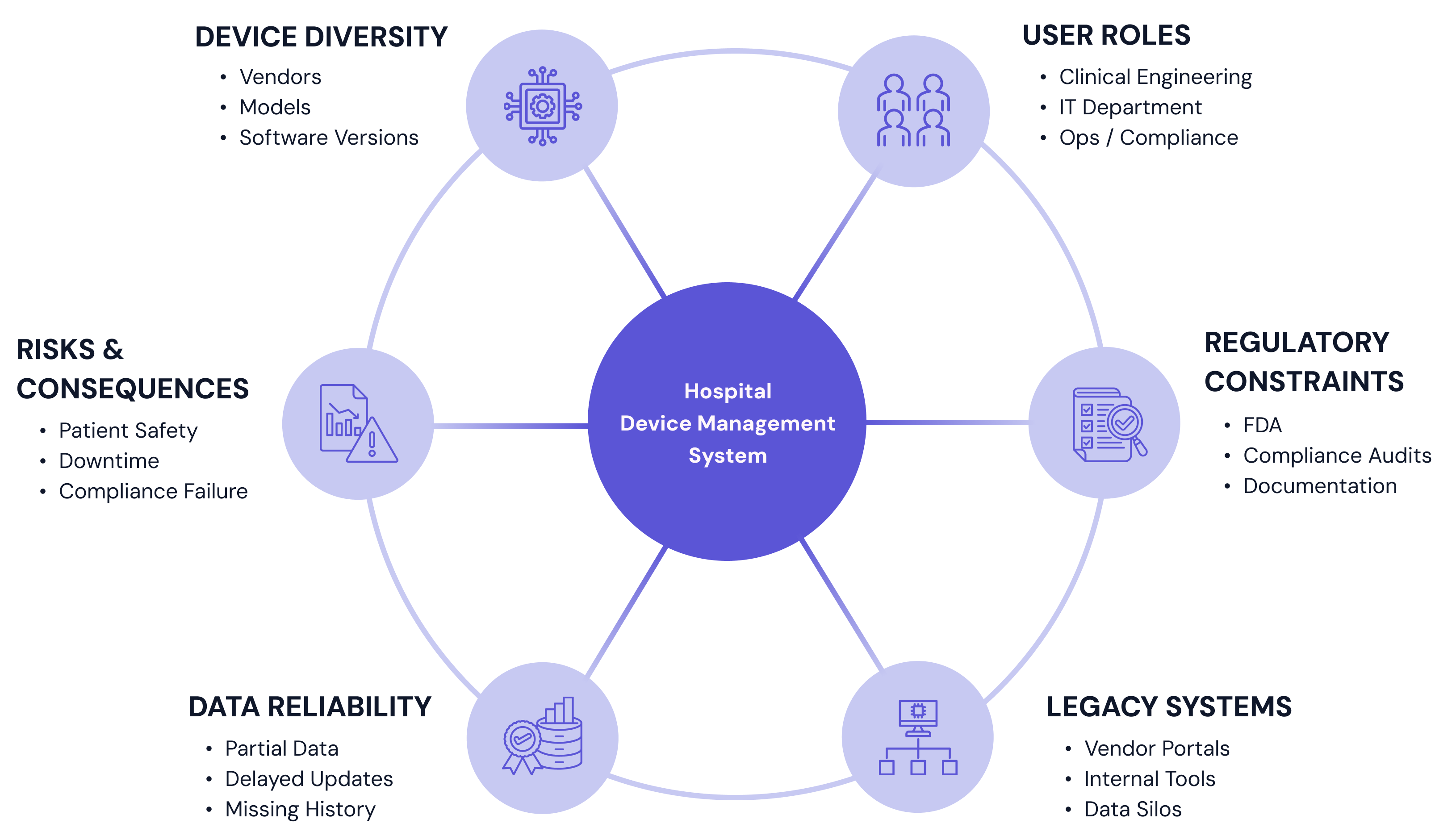
Hospitals manage thousands of medical devices across departments, each with its own maintenance, compliance, and operational requirements. This concept project explores a SaaS dashboard for medical device management, designed to help clinical engineering and IT teams monitor device health, prioritize issues, and maintain compliance in a complex healthcare environment. The emphasis is on scalable systems, clear information hierarchy, and decision-support under real-world constraints.


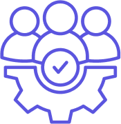
• oversees medical device fleets
• ensures safety, compliance, & lifecycle mgmt
• own maintenance schedules & certifications
• performs hands-on maintenance and repairs
• responds to device issues and failures
• update firmware and configuration
• manages integrations, networks, and security
• supports device connectivity and data flow
• handles access, uptime, and infrastructure
• coordinates physical locations and rooms
• tracks device availability and movement
• manages space, power, and infrastructure
• tracks inventory and procurement
• manages replacements and expired devices
• balances cost, availability, and demand
• oversees regulatory adherence
• prepares for audits and inspections
• reviews device documentation and history

Responsible for hundreds or thousands of devices

Managing competing priorities across locations

Working across spreadsheets, legacy tools, & vendor systems

Responding quickly while maintaining
safety standards
Because this project was developed as a concept study, key assumptions were defined to reflect realistic hospital environments rather than idealized conditions. These constraints grounded the design in operational and technical realities.

• Clinical engineers and IT staff are experienced but overextended
• Users frequently multitask and switch contexts
• Training time is limited, and reliance on documentation is low

• Device data may come from multiple sources with varying reliability
• Real-time status is not guaranteed for all devices
• Historical data may be fragmented or incomplete

• Legacy systems coexist with modern platforms
• Integration standards vary across facilities
• Security and compliance requirements constrain design decisions

• Initial exploration and alignment conducted within a constrained timeline
• Focus was on defining a scalable foundation rather than every edge case
• Prioritization of core workflows over exhaustive feature coverage
Instead of designing around device attributes or database structures, the problem was framed around how users think about risk and responsibility. The interface is designed to reflect these mental models by prioritizing status and urgency over raw data, grouping devices by risk, state, or required action, and providing clear, guided paths from awareness to resolution.


To validate these designs, they were evaluated against a small set of quality checks focused on clarity, trust, and decision support in clinical contexts where accuracy and clarity directly affect care quality as well as operational outcomes.
• Does the interface avoid overwhelming users with raw data?
• Is status clearly communicated to support accurate decision making?
• Are core workflows prioritized over edge cases?
• Does the system feel trustworthy and predictable in daily use?
Hospital clinical engineering and IT teams are responsible for managing large inventories of medical devices across departments, vendors, and locations. Existing tools often surface large amounts of data without clear prioritization, forcing users to piece together information across multiple systems to understand device status, risk, and next actions.
As a result, teams spend unnecessary time searching, cross-referencing, and interpreting data, increasing cognitive load and slowing response in situations where speed and clarity matter. The core problem is not a lack of data, but a lack of clear, trustworthy signals that help users decide what requires attention now versus what can wait.

Insights from user research informed a set of design principles that guided decisions throughout the project and helped maintain consistency as complexity increased.

Surface the most important information first and avoid overwhelming users with unnecessary detail. The interface should help users understand what matters now before exposing everything that exists.

Users must trust the system in order to rely on it. Data freshness, system status, and uncertainty should be clearly communicated to avoid false confidence or misinterpretation.

Assume users are knowledgeable but time-constrained. The interface should minimize mental effort by using familiar patterns, clear hierarchy, and predictable interactions.

The goal is not to display data, but to help users decide what action to take. Design choices should guide attention and next steps without removing user judgement.

The system should remain usable as device inventories grow, organizational structures change, and new device types are introduced.
Surface the most important information first and avoid overwhelming users with unnecessary detail. The interface should help users understand what matters now before exposing everything that exists.
Users must trust the system in order to rely on it. Data freshness, system status, and uncertainty should be clearly communicated to avoid false confidence or misinterpretation.
Assume users are knowledgeable but time-constrained. The interface should minimize mental effort by using familiar patterns, clear hierarchy, and predictable interactions.
The goal is not to display data, but to help users decide what action to take. Design choices should guide attention and next steps without removing user judgement.
The system should remain usable as device inventories grow, organizational structures change, and new device types are introduced.
The visual system was designed to support clarity, consistency, and scalability across a complex, data-heavy product. Rather than focusing on brand expression or visual novelty, the system emphasizes restraint, predictability, and reuse.
The interface is built around a small set of flexible, reusable components that can support multiple views.

Components were designed to be composable building blocks, allowing the same patterns to support dashboards, detail views, and device lists - without introducing new interaction models.
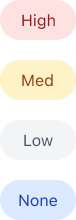
Communicates device health, risk, and urgency at a glance

Placed appropriately to reduce decision friction
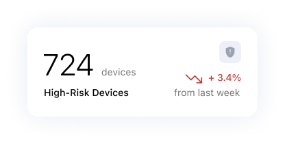
Surfacing high-level signals before detail

Designed for scanning, comparison, and prioritization
Interaction patterns favor familiarity over novelty, allowing users to orient quickly and act with confidence.
The system relies on:
Information hierarchy was critical to ensuring users could quickly assess system state, identify urgency, and take action without scanning unnecessary detail.
The interface is designed so users can quickly answer:

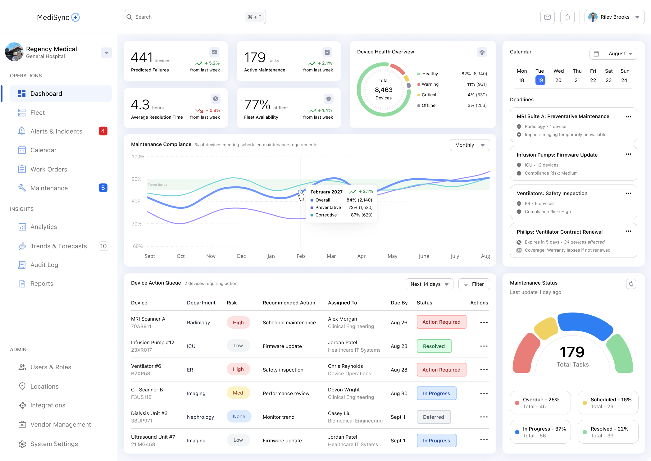
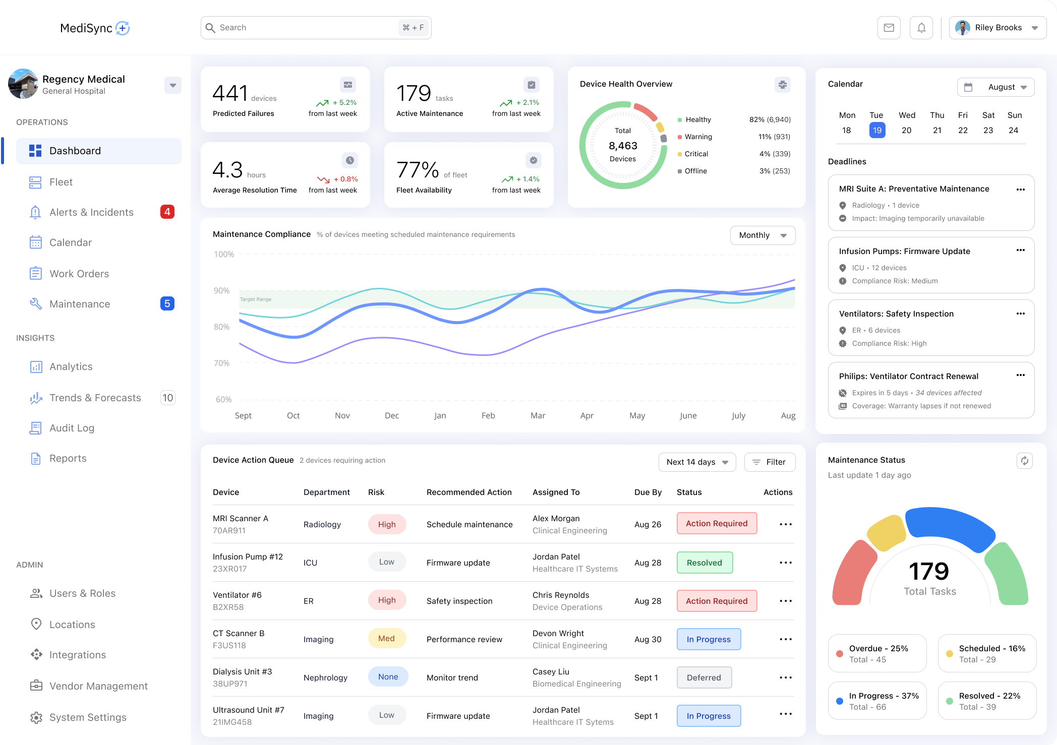
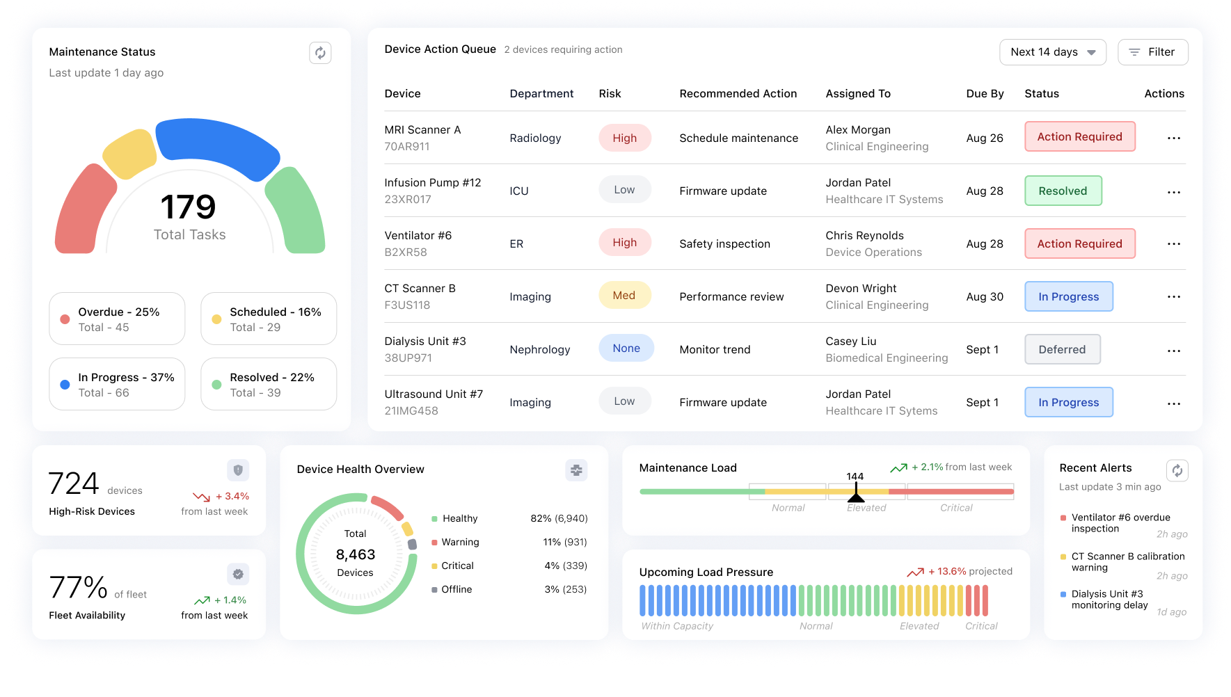
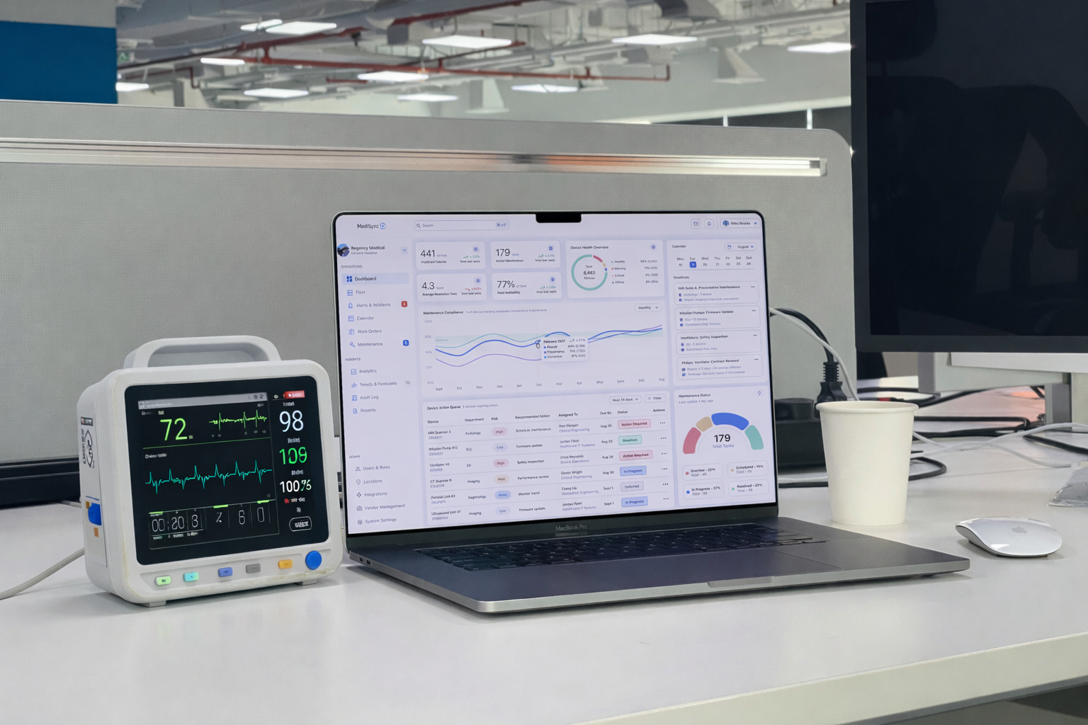
The dashboard prioritizes situational awareness over detail - surfacing key signals, trends, and areas of risk to help users orient quickly before taking action.
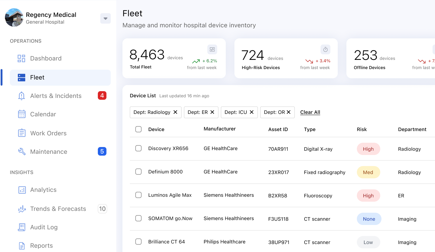
From the dashboard, users navigate to a device list designed to support fast scanning, comparison, and prioritization across thousands of devices.
Key goals of this screen:
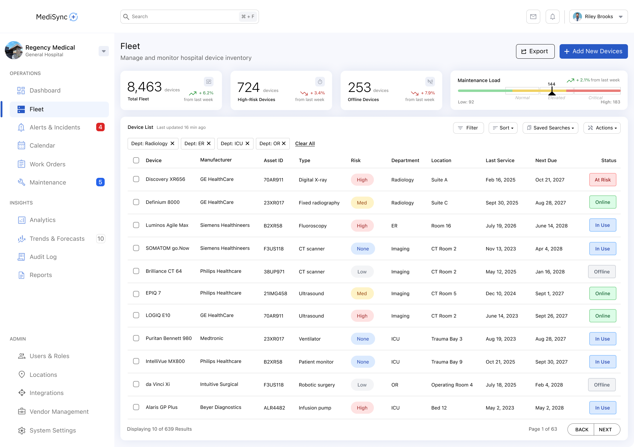
The list view balances density and clarity by focusing on actionable attributes rather than exhaustive data.
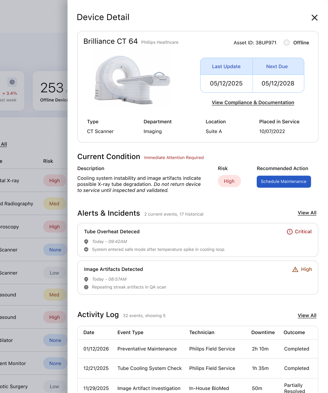
From the device list, users navigate to a focused detail view designed to support investigation, contextual understanding, and confident decision-making for individual devices.
Key goals of this screen:
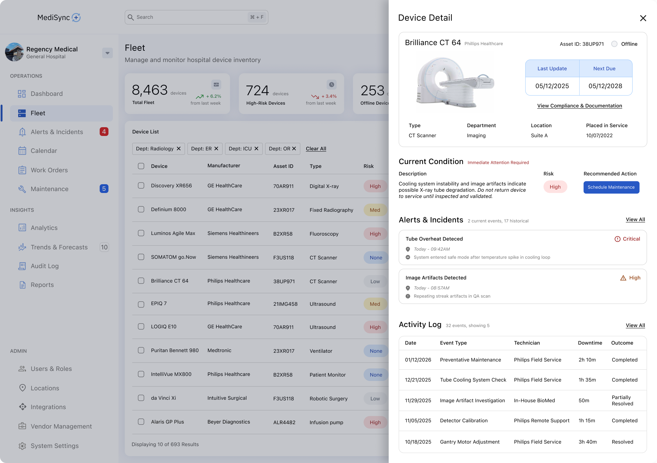
Design Rationale: The device detail view is structured around what users need to decide, not everything the system knows. Information is grouped to reflect user mental models—current condition, relevant history, and next actions—supporting focused investigation without overwhelming the workflow.
Alerts and priority indicators are treated as system-level signals, ensuring urgency is communicated consistently across dashboards, lists, and detail views.
Key goals of the alert system:
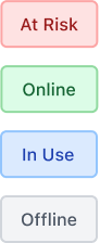
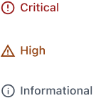
Consistent priority signaling eliminates the need for users to reinterpret urgency as they move through the system.
Several deliberate decisions were made to avoid unnecessary complexity and maintain focus.
In a high-stakes healthcare environment, complexity increases risk. Users need to assess situations quickly, and overly dense interfaces slow comprehension and increase cognitive load. Complex interaction models also raise training burden, while calm, restrained interfaces reduce the likelihood of error under pressure. For these reasons, simplicity was treated as a safety feature, not an aesthetic preference.
Rather than designing for maximum flexibility, the product emphasizes clear priority, progressive disclosure, and consistent patterns across screens. This approach allows critical information to surface first while preserving access to deeper detail when needed, supporting both new and experienced users without sacrificing depth.
If this project were to continue, the next steps would focus on validation, refinement, and extensibility. These steps would ensure the system remains reliable, scalable, and aligned with real operational needs.


When I first approached this project, I initially framed it as a device monitoring dashboard - focused on surfacing maintenance tasks, alerts, and operational metrics. But as I worked through the workflows, escalation paths, and cross-department responsibilities, it became clear that the real challenge wasn't monitoring devices at all. It was helping teams interpret fragmented signals and understanding what required action, when, and why. That shift moved the design away from a feature-driven dashboard toward a decision support system built around clarity, prioritization, and operational trust.
Because of that shift, this project reinforced the importance of designing for clarity, trust, and restraint in complex, multi-team environments. Rather than optimizing for feature depth or visual novelty, the work focused on reducing uncertainty and supporting confident decision making under real world constraints. The exercise also highlighted how much of effective enterprise design happens before pixels - through problem framing, tradeoffs, and systems thinking. Strong UX in high-stakes domains is less about adding capability and more about removing friction, noise, and risk.